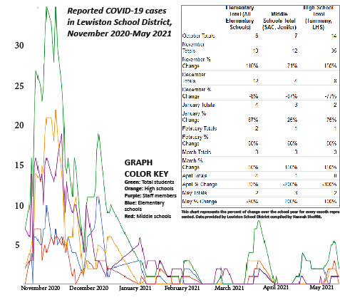
Graph of COVID-19 cases shows year-long trends
Numbers compiled by Hannah Shoffitt. Graph created by Maggie Bulkley.
The COVID-19 data used in this graph is provided by the Lewiston School District. Superintendent Dr. Robert Donaldson’s daily emails to report COVID-19 cases were analyzed and compiled by student staff members of The Bengal’s Purr. The dates span from Oct. 23, 2020, to May 17, 2021.
In reviewing the results, Jamie Morton, a science teacher at LHS (with an avid interest in virology,) noticed the trends heightened when the mask mandates were removed and coming back from long breaks.
Brent Jacobs, the probability and statistics teacher at LHS, added that the trends in the graph are “indicative of what we’ve been seeing in our community and county.”
In the graph below the blue line represents the elementary schools (Camelot, Centennial, McGhee, McSorley, Orchards, Webster, and Whitman.) The red line represents the middle schools (Jenifer and Sacajawea.) The orange line represents the high schools (Lewiston and Tammany.) The green line represents the active cases amongst all students in the Lewiston School District. The purple line represents the active cases of all staff members employed in the School District.